A brand that speaks human in the world of finance
The credit market in Portugal is saturated, crowded with institutions that speak in the same voice: technical, transactional, and impersonal. Most competitors position themselves purely as providers of financial products, focusing on rates, fees, and formalities.
The Challenge
TD Crédito, a credit intermediary, held a different ambition. Rather than being seen as another broker of credit solutions, the organisation wanted to be recognised as a partner who stands beside customers at decisive moments in their lives.
The challenge was twofold:
Strategic: Reframe the brand’s role from financial facilitator to life enabler.
Expressive: Build a verbal and visual identity that communicates empathy, trust, and clarity in a sector where those qualities are rare.
The aproach
We began with an extensive research and audit phase:
Stakeholder interviews and workshops to capture the expectations of employees, partners, and customers.
Competitor analysis across the Portuguese financial sector, identifying the prevalence of a cold, technical tone.
Benchmarking international best practices, noting how financial brands abroad balance rigour with empathy.
This groundwork revealed a clear opportunity: most players treated credit as a product; few treated it as a human journey.
The insight
Credit is never the end goal. People don’t aspire to “take a loan” — they aspire to buy a car, start a business, or realise a long-postponed dream. In other words, behind every request for credit lies a human story.
By reframing credit around dreams and aspirations rather than rates and paperwork, TD Crédito could occupy a distinctive, meaningful space in the market.


The expression
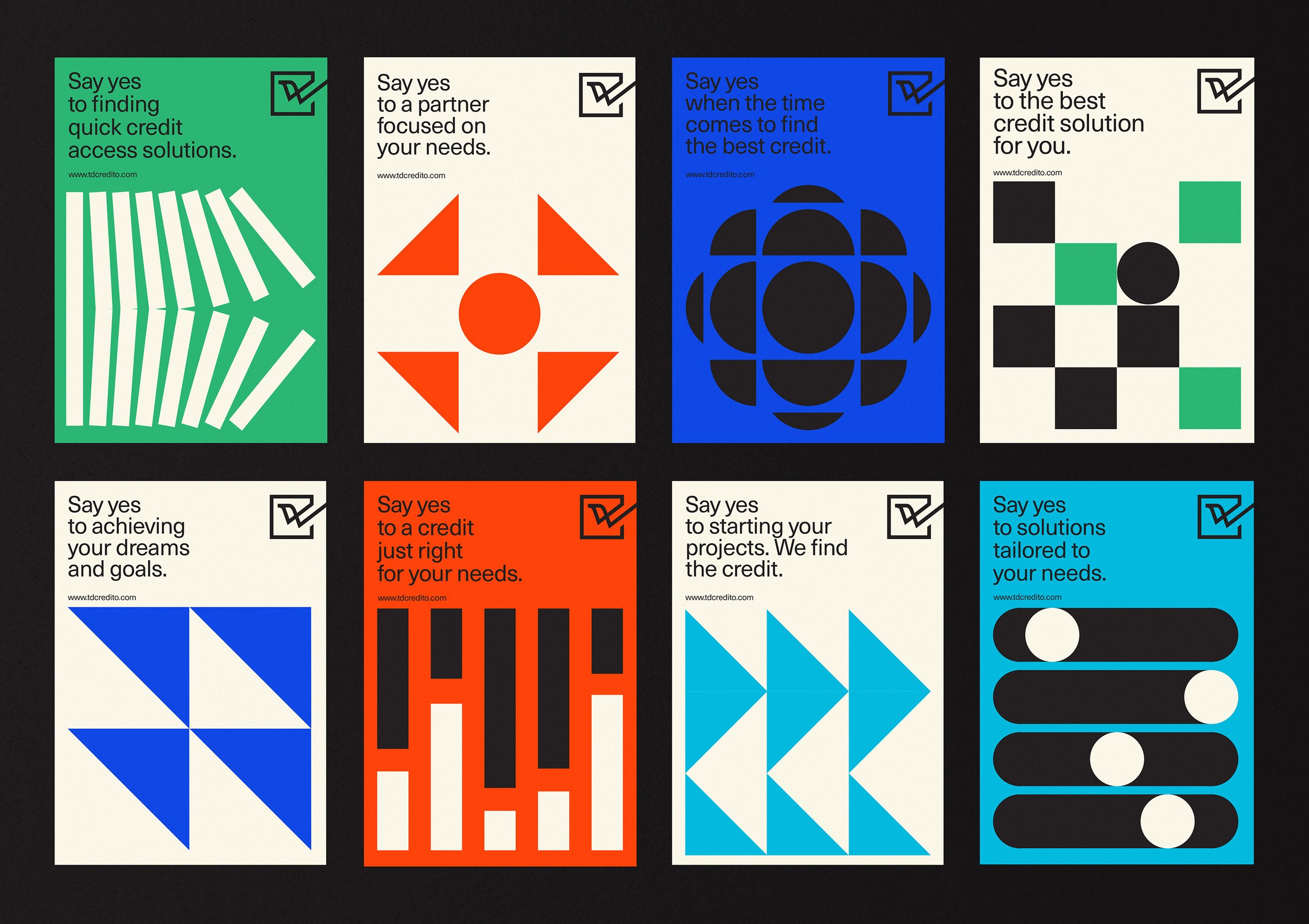
We created a brand voice that rejects jargon in favour of human language. Simple, empathetic, and transparent, it makes customers feel heard and supported. Guidelines were developed to ensure consistency across digital, advertising, and partner communications.
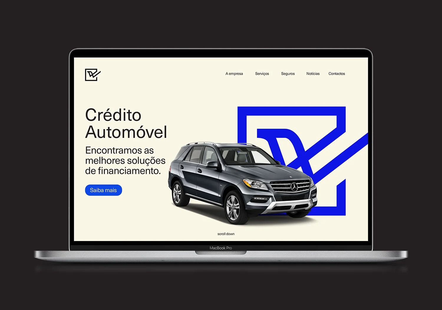
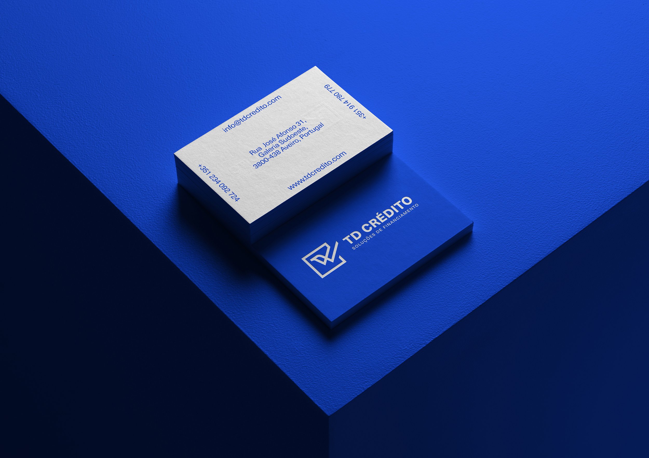
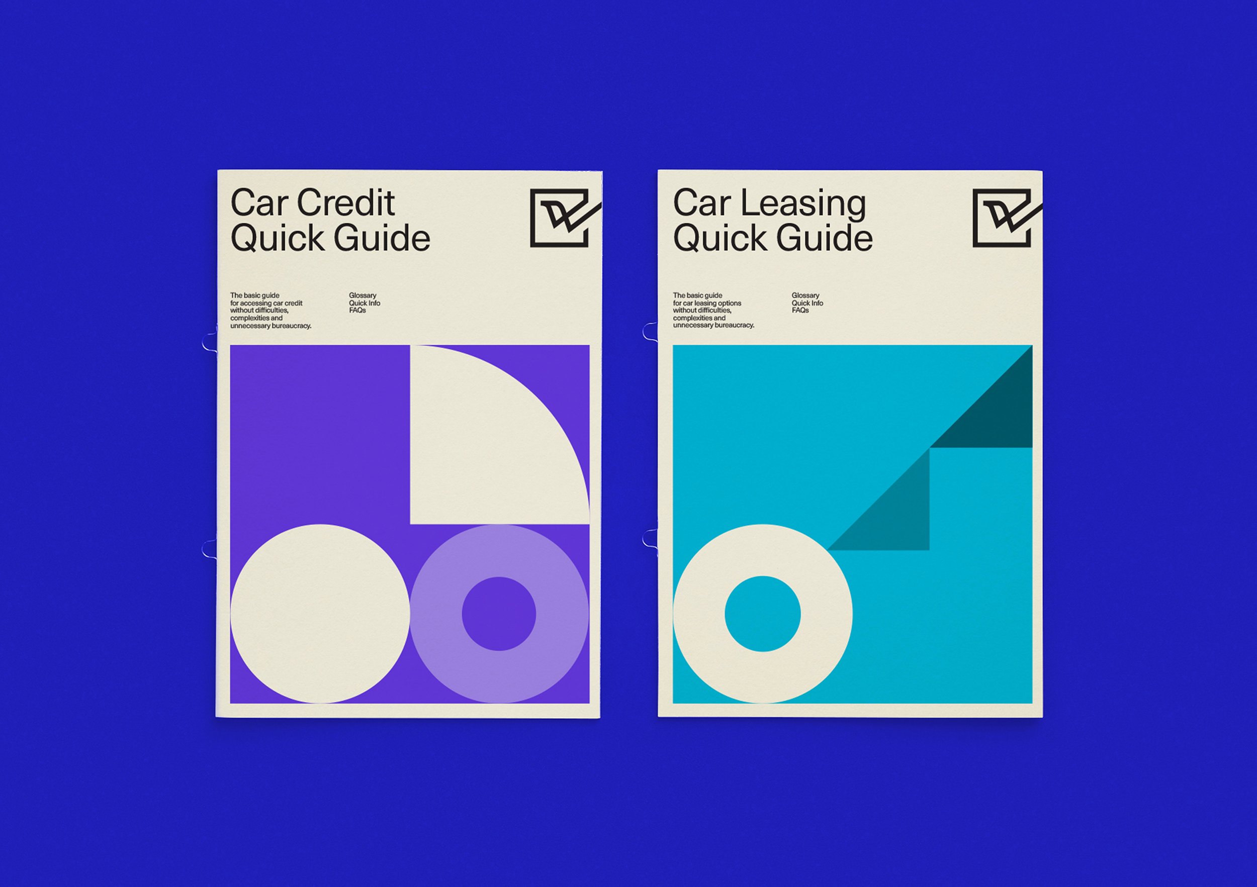
As for the visual identity, we developed a dynamic symbol representing the fulfilment of dreams through successful credit approval as a logo - a checkmark that becomes a bird in flight.
The graphic universe was based on a vibrant colour palette (blue, green, orange) symbolising trust, growth, and energy in a geometric graphic language conveys decisiveness and momentum.
From stationery and business reports to mobile-first platforms, every touchpoint reinforces TD Crédito’s role as a reliable, approachable guide..
The impact
The transformation of TD Crédito was more than visual. It repositioned the company as a human-centric intermediary in a marketplace dominated by transactional voices.
Internally, the new strategy gave employees a clearer sense of purpose: to be partners in people’s dreams.
Externally, customers and partners recognised TD Crédito as a trustworthy, approachable brand; a rare quality in financial services.
The verbal identity provided a unifying compass for communication, ensuring the brand “speaks human” consistently.
TD Crédito moved from being another financial intermediary to becoming a symbol of encouragement and partnership in the lives of its customers.
TD Crédito’s rebrand demonstrates how even in the most technical and competitive industries, brands can win by putting people at the center. By reframing credit not as a transaction but as a gateway to aspirations, TD Crédito now speaks human, and stands apart.